
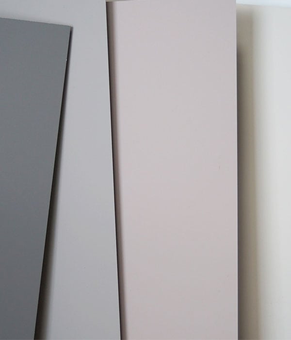
Composite panels are typically available in dozens of color options, and the widest ranges feature over a hundred colors. For example, the KERROCK composite panel color palette covers a wide spectrum from neutral tones to bold color accents, making the material suitable for both public spaces and private interior design projects. Below, we review the breadth of the color selection, categories, customization possibilities, and practical tips for choosing the right color.
How many colors are available in composite panels?
The color range of KERROCK composite sheets covers over a hundred standard colors, divided into clear color families. This makes KERROCK composite sheets one of the most versatile surface materials on the market when comparing just the number of standard colors to other similar products. Designers or manufacturers can find a suitable shade in the selection for almost any application.
The breadth of the color range is particularly important in composite materials because the material is colored throughout its entire thickness. This means that surface scratches or wear do not reveal a differently colored underlying surface, but rather the panel maintains a uniform color throughout its lifespan. A wide color palette combined with this technical feature makes composite panels a particularly attractive option for high-traffic areas.
What color categories can be found in the selection of composite panels?
The color range of KERROCK composite sheets is divided into several distinct categories: white and light shades, gray and stone-like shades, beige and natural colors, dark and black shades, as well as bold color accents such as blue, green, and red. In addition, the selection includes stone imitations and shades combining other surface structures.
Neutral and earthy tones
White, grey, beige, and natural colors make up the most popular part of the selection. These shades are particularly suited for kitchens, bathrooms, and public spaces where a timeless and easily combinable surface is desired. Stone-like grey and beige shades mimic the appearance of natural stone while offering the practical advantages of a composite material.
Strong and dark shades
The popularity of dark tones, such as anthracite and black, has grown particularly in modern interior design. Strong color accents, in turn, are suitable for projects where the surface material is intended to act as the main element of the design. These shades are popular, for example, in restaurant and hotel environments as well as in striking private homes.
How does the color of a composite panel affect its application?
The color of the composite panel directly affects its suitability for different applications. Light shades reflect light and are well suited for small spaces or those with limited natural light, while dark shades create a sense of space and are suitable for executive environments. The choice of color also affects how easily surface dirt or wear is visible in daily use.
In public spaces such as schools, hospitals, and restaurants, medium gray or neutral tones are often favored because they visually withstand daily wear and tear and are easy to keep clean. In kitchens and wet rooms, the choice of color is often also related to an overall interior design plan, where the shade of the wet room panel is matched with other surfaces and furnishings. Strong colors work best in projects where the surface is a deliberate focal point of the design rather than a neutral background.
It is also good to note that the through-colored structure of the composite board makes the color permanent regardless of how heavily used the surface is. This is a particularly significant advantage in wet rooms and high-hygiene requirements, where surface scratches or dents must not reveal a differently colored inner structure.
Can you get a composite panel in a custom color?
Yes, KERROCK composite sheets are also available in custom colors outside of the standard range. A custom color typically requires a sufficiently large order quantity, and the delivery time is longer than for standard colors. This option is particularly suitable for large projects where a specific brand color or a unique color palette is the starting point of the design.
When considering a custom color, it is worth taking contacting the material supplier in the project schedule well in advance, so that color grading, sample ordering, and the production schedule can be aligned with the project timeline. We at Lorel help our clients figure out customization options and coordinate communication with the manufacturer to make the process as effortless as possible.
How to choose the right color for a composite panel for your project?
Choosing the right color for a composite panel starts with three factors: the intended use of the space, the lighting, and the color scheme of other surfaces. The color should not be chosen based on a sample piece alone; instead, it should be evaluated in the actual lighting conditions and together with other materials. This reduces the risk of the chosen shade looking different when installed than it did on the sample.
- Intended use of the space: Public spaces and high-traffic environments benefit from neutral and medium-dark tones that can withstand visually intense use.
- Lighting: Natural light and the color temperature of artificial light significantly affect how the shade of the composite panel looks when installed. Evaluate the color in both daylight and artificial light.
- Other surfaces and furniture: Match the color of the composite panel to surrounding materials, such as wood surfaces, metal parts, and flooring, to ensure a harmonious overall look.
- Maintenance and cleanliness: Very light and very dark shades can emphasize fingerprints and surface scratches. Consider this especially on high-touch surfaces.
- Longevity and adaptability: Timeless neutral shades withstand trends better, which is particularly important in public spaces and long-lasting interior design solutions.
Ordering color samples before making a final decision is always recommended. Kerrock composite panels The color selection is wide, and a concrete sample in the right environment is the most reliable way to make sure that the chosen shade works specifically for your project. Also check out to all available surface material products to find the most suitable solution for your project.
