Colour and tone are the cornerstones of interior design, determining the mood, usability and overall look of a space. Surface materials, such as a range of laminates, veneers and composite panels sets the basis for the whole design. The right choice of colours and tones will make a space inviting, functional and fit for purpose. In this article, we discuss colour and shade selection from a professional perspective and offer practical advice for successful colour planning in a variety of projects.
The impact of colours on the atmosphere and functionality of a space
Colours have psychological effects, which guide the emotions and actions of the users of the space. Shades of blue are calming and communicate a sense of reliability, which is why they are often seen in office environments and healthcare spaces. Warm tones such as orange and red, on the other hand, activate and create an energetic atmosphere, making them excellent choices for creative spaces and restaurants.
Colours also affect the perceived size of the space. Light shades open up the space, while darker shades bring the walls closer together. This principle can be used to create the illusion of a smaller or larger space, depending on the intended use. In public spaces, such as hospitals and schools, the clarity and consistency of colours also helps with orientation and perception of space.
Examples of the use of colours in different spaces:
- In office spaces, neutral tones such as grey and beige create a calm background that can be enlivened with corporate brand colours. composite materials with the help of.
- In restaurants and shops, bolder colours can be used on surfaces to attract customers' attention.
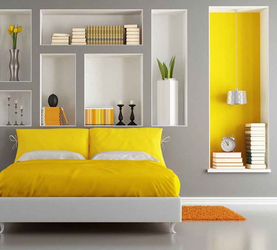
- In homes, bedrooms benefit from calming tones, while kitchens and dining areas can incorporate brighter colours to whet the appetite.
How to choose a sustainable and functional colour palette for your project?
Creating a colour palette that works begins on the choice of main colour, which is often determined by the use of the space and the brand identity. Around this, a harmonious ensemble is built using accent colours and neutral tones. The classic 60-30-10 rule is a useful starting point: 60% for the primary colour, 30% for the secondary colour and 10% for the enhancement colour.
The following principles will help you to create a colour harmony:
- Monochromatic: different shades and darkness levels of the same colour
- Complementary: the opposite colours of the colour wheel, such as blue and orange
- Analogue: a colour wheel with adjacent colours, such as blue, blue-green and green
When choosing colours for surface materials such as laminates, consider their relationship to other surfaces. If you have a showy piece of furniture or wall surface, you should choose more subdued shades to match other surfaces. When choosing colours for surface materials, it is also important to remember that large surfaces look more intense than small samples of colour. It is therefore always best to view the material in the final lighting and as a large enough surface.
Colour design challenges in surface materials
One of the biggest challenges in choosing colours is the effect of lighting. The same shade can look completely different in natural light than in artificial light. This is especially true for laminates and other glossy surfaces. The surest way to ensure colour performance is to test the material in its final location at different times of the day.
Another major challenge is matching colours between different materials. Even if two materials have the same shade, their surface texture and gloss level can make them look different. This can be controlled by choosing materials with a surface texture that supports the desired visual appearance.
Colour fastness and ageing are also factors worth considering. Some colours, especially bright reds and blues, can fade more quickly than others when exposed to UV radiation. However, in high quality surface materials, colours are protected against UV radiation, which prolongs their lifetime considerably.
Trends and timelessness in colour choice
Colour trends change regularly, but certain shades remain popular year after year. The current favourites are natural shades such as moss green, terracotta and sandy brown, which add warmth and cosiness to the space. Pastel and broken colours are also popular for their versatility.
The use of trend colours should be carefully considered for surface materials intended for long-term use. A good rule of thumb is to use trendy colours in smaller, more easily interchangeable elements and opt for more classic, timeless shades for larger, more permanent surfaces.
Timeless colour choices include:
- Neutral shades of grey and beige
- Colours of natural materials such as wood and stone
- Broken, earthy tones
These can easily be complemented with contemporary colours, for example in loose furniture or smaller interior elements.
Technical characteristics in the choice of colour
The choice of colour must also take into account the technical characteristics. Dark colours show scratches and dust more easily than light-coloured ones. On the other hand, light-coloured surfaces reveal stains and dirt more easily. This is particularly important to bear in mind in high-use areas such as public buildings and restaurants.
The technical durability of the paint is also influenced by the manufacturing technology of the material. For example, through-dyed materials, such as certain composite panels, retain their colour better in the event of scratches and abrasion than materials that are only surface-dyed.
Colours to suit different applications:
- High-use areas: more medium, earthy tones that mask wear and tear
- Food premises: light, easy-to-clean shades
- Outdoor and sun exposed surfaces: UV-protected colours
- Bathrooms and wet rooms: water-resistant materials that do not change colour when exposed to moisture
The choice of colour and shade is not just an aesthetic decision, but has a significant impact on the functionality, durability and user experience of the space. Careful design and quality surface materials ensure that colours serve their purpose for years to come. We offer a wide range of high quality finishes in a variety of colours and shades to help you find just the right solution for your project. Examples and references of completed projects to get ideas for your own colour scheme.